VT220 Built-in Glyphs
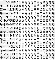 |
Figure 1 shows all the glyphs (character shapes) built into the VT220 terminal. There are the printable ASCII characters (94), DEC Supplemental set (94), Display Controls set (67), DEC Special Graphics (32) and the reversed question mark, used to represent undefined characters, for a total of 288. This figure has been produced by dumping the ROM of a 1986 vintage VT220-F3 with version 2.3 firmware. Each character is 8 pixels wide by 10 pixels high. I’ve used a light grey background to show the limits of each character. In 80-column mode, the VT220 makes every character ten pixels wide, by a technique discussed below. In 132-column mode, each character is made nine pixels wide.
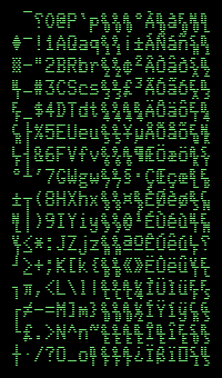 |
Eagle-eyed readers will note that this picture doesn’t look much like the screen of a real VT220, which I’ve tried to represent in Figure 2. If we ignore the colour of the characters, there are two other differences. Firstly, the characters on the screen appear more stretched vertically than Figure 1 suggests. The VT220, in common with most other text terminals, has a distinct gap between scan lines of the display, which almost doubles the height of each character.
The second difference is in the details of the character shape, which can be most clearly seen on the lowercase letters. If you take a look
at the lowercase “a”, “g” and “p”, you may notice that the ROM picture shows gaps between the vertical stems and bowls of these characters
that are missing on the display. The VT220 display was refreshed at 60 Hz, which is slow by today’s standards. This slower refresh rate required a slower phosphor on the CRT, or users would notice flickering. However, slower phosphor means slower to light up as well as slower to fade, and this slow rise time would make single pixels almost invisible. The video circuitry compensates for this with a “dot stretching” circuit, which causes single lit pixels (or a run of them) to be extended by one pixel to the right, such that one lit pixel from the ROM becomes two on the screen, two lit pixels in a row from the ROM become three on screen, and so on. This stretching means that single off pixels in a character disappear when characters are displayed on single-width lines.
you may notice that the ROM picture shows gaps between the vertical stems and bowls of these characters
that are missing on the display. The VT220 display was refreshed at 60 Hz, which is slow by today’s standards. This slower refresh rate required a slower phosphor on the CRT, or users would notice flickering. However, slower phosphor means slower to light up as well as slower to fade, and this slow rise time would make single pixels almost invisible. The video circuitry compensates for this with a “dot stretching” circuit, which causes single lit pixels (or a run of them) to be extended by one pixel to the right, such that one lit pixel from the ROM becomes two on the screen, two lit pixels in a row from the ROM become three on screen, and so on. This stretching means that single off pixels in a character disappear when characters are displayed on single-width lines.
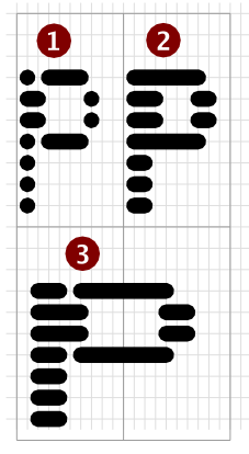 |
The effect of this dot stretching is shown in Figure 3.
This is how the ROM representation of the lowercase “p” would appear on-screen if there was no dot stretching in the video circuitry. You can see that the vertical stem is just a single pixel wide, which would be almost invisible.
With the dot-stretching circuitry. This is how “p” actually appears on single-width lines.
Double-width characters are produced by doubling-up each pixel from the ROM before the bits for each scan line get stretched, so the single dots of the stem get doubled to two pixels before reaching the video circuitry, and then the run of two pixels gets stretched to three, which now doesn’t completely cover the two-pixel gap before the bowl of the “p” starts.
So, oddly enough, double-wide characters reveal more detail of the original design than single-width characters, which hopefully explains why the ROM representation didn't have every “on” pixel doubled-up (which would’ve saved some video circuitry).
Double-width, double-height characters are produced by repeating scan lines; dot-stretching only occurs horizontally, not vertically.
Line-drawing characters
I said at the beginning that characters in 80-column mode are 10 dots wide on screen, and 10 dots (scan lines) high. The designs in ROM are only 8 bits wide (one byte per scan line). Even with dot-stretching, this would mean that the widest characters could only be 9 dots wide, which isn’t enough to make characters join horizontally.
The VT220 Technical Manual doesn’t explain how this is achieved, but the VT100 Series Technical Manual does (although it gets the explanation wrong!), and a few experiments show that the VT220 works the same way.
When the 8-bit dot patterns are retrieved from ROM, they are turned into a 10-bit pattern by repeating bit 0 twice more on the right-hand side. Only the line-drawing characters that will be joining horizontally have bit 0 set on any scan lines, so this doesn’t distort the shape of letters; they will have two unlit dots added to the right-hand side.
However, the VT220 allows the creation of a soft character set, up to 8 × 10 pixels, and these will also be affected by this copying of bits, so you need to be aware that setting the eight bit on any scan line will result in four dots being lit on screen (the original dot, two copies, and then a fourth produced by dot stretching).